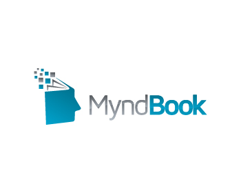


Remove the tag line. Line up image with rest of the text.
The final logo should be with transparent background and should come in two color variations:
- one for use on dark blue header (grey and white seems ok)
- another for use on lighter color body background
The current font is ok, but seems bland.
- Select better font (see the logos on the right for ideas)
- Perhaps each letter should be less wide, but taller and thicker?
- Other fonts to try (from Microsoft Word 2007): Pristina, Papyrus, Lucida Handwriting
- Try both all caps or first letter caps for MyndBook

Refinements Needed
Please see if it can be made nicer with shadows, or 3d effects.
However, keep the note map same size & orientation as our top choice -- in the newer ones, the note map is too much angled.

The notemap and the shadow effects in this logo are good. But the font still needs improvement. It looks too bulky -- can we get other font variations, please?
Even the font variations shown here are either too thin or too thick -- we need medium thickness: http://matthewv.me/14_MyndBook/
Mathew's previous work has some nice fonts that seem to go well with their logos:
http://matthewv.me/4_logodesign/32.html
http://matthewv.me/4_logodesign/18.html
http://matthewv.me/4_logodesign/17.html
http://matthewv.me/4_logodesign/48.html
Or, try medium thickness modern logos at:
http://www.google.com/webfonts#